Note
The dialog element has reached the tipping point of generally being the better option for web developers who need to implement dialogs in their web pages. The number of accessibility requirements a developer needs to be aware of, and the level of effort to implement custom ARIA dialogs is now largely taken care of by browsers. — Scott O'Hara
<button commandfor="my-dialog" command="show-modal" type="button">☰</button>
<dialog id="my-dialog" closedby="any">
<!-- This form will close its dialog when submitted -->
<form method="dialog">
<header>
<h3>Dialog title</h3>
<button onclick="this.closest('dialog').close('close')">✗</button>
</header>
<article>…</article>
<footer>
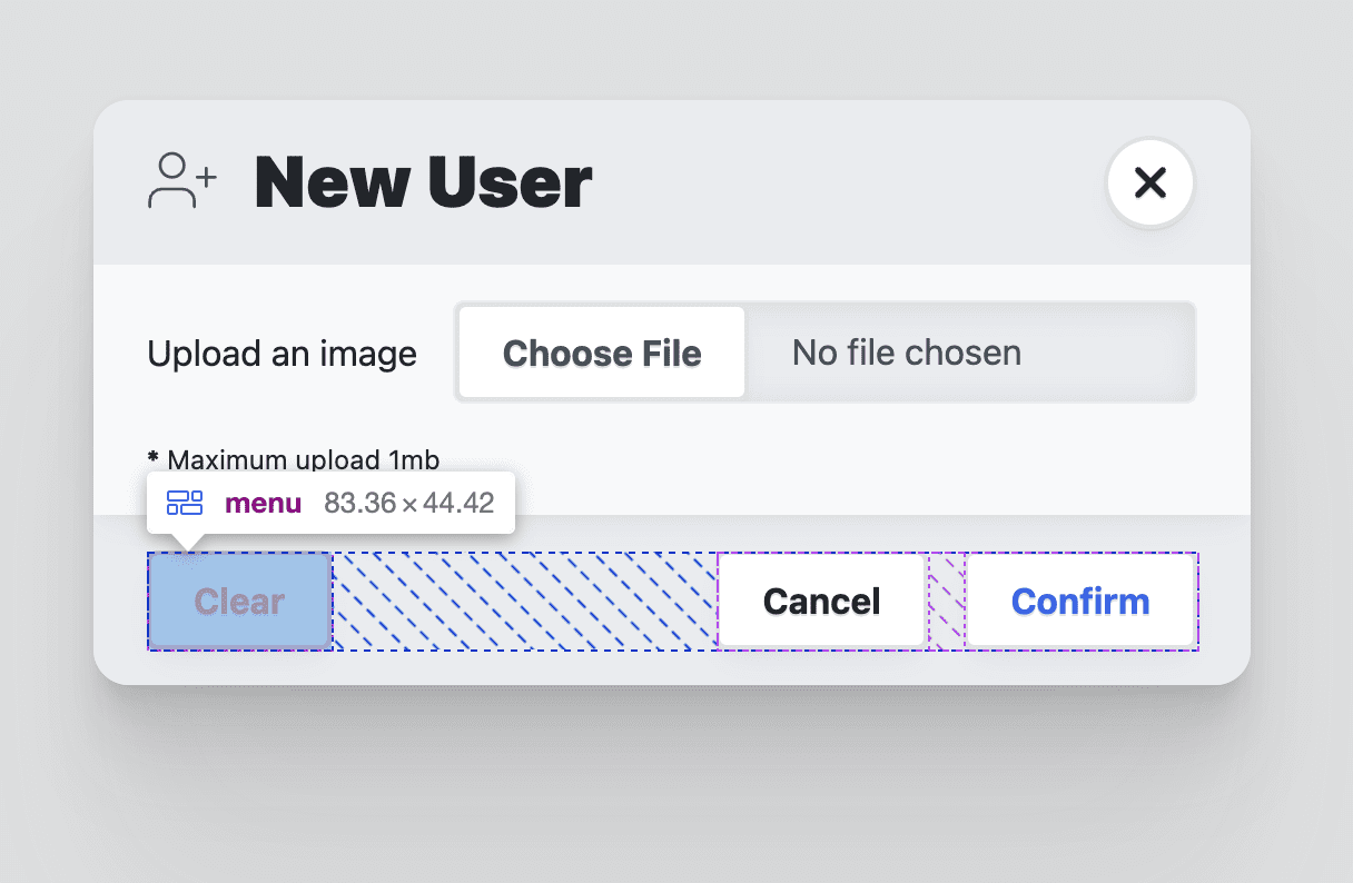
<menu>
<button autofocus type="reset" onclick="this.closest('dialog').close('cancel')">Cancel</button>
<button type="submit" value="confirm">Confirm</button>
</menu>
</footer>
</form>
</dialog>dialog::backdrop {
/* Styles and animations for the backdrop */
}- 2024-11-14 — Have a dialog
- 2024-11-01 — Dialog light dismiss behavior:
closedbyattribute /requestClose - 2023-01-26 — Use the dialog element (reasonably)
- 2022-04-13 — Building a dialog component
- 2022-03-08 — A look at the dialog element's super powers
- 2022-02-08 — Replace JavaScript Dialogs With the New HTML Dialog Element
- (Invokers Proposal) Add InvokeElement & InvokeEvent IDLs & invocation steps for Dialog & Popover
- Bikeshed a name for "light dismiss for dialog"
- Consider preventing page scroll when modal dialog is visible
- Entry/Exit animation 2024